The sun is shining (well it did occasionally on the day) and what better way to while away a Sunday afternoon than wandering around a classic car show. For the typoholic, this also presents me another opportunity to indulge…


There is still more to come too!


Another edition of vintage GRAPHIS. Enjoy…

Notice the header? You know how I change the typeface every month (go look in the header archive if you haven’t), well now you have a chance to get your typeface up there. This is an open call to showcase new typefaces!

This month I present to you ‘Coalescence’ by Texas-based typographer and bookbinder Becca Hirsbrunner.

Becca says “I created Coalescence as a part of my thesis/final project for my master of fine arts degree from the University of Texas at Arlington. I’ve traveled quite a bit since college, and the design grew out of a beautiful bit of Arabic design, henna patterns, and other details from the pictures I took during my wanderings.

It comes in three versions, each more complicated than the last with dots and swirls and negative areas. At the moment the font only has lower case. I’ve been sketching ideas for capitals ever since completing my degree…but I’ve not yet been able to find a style that matches Coalescence’s current rhythm and personality.


LINKS
http://beccamakingfaces.com/

Thanks very much to Becca for allowing me to feature her work here.

So what typefaces have you designed? I would like to feature new work, experiments and non-commercial typefaces once a month – all you have to do is send me an email with a small sample image attached and a little information about your design. Submissions are welcome from professional designers, students and the typographically inclined.

christopher (at) lestaret (dot) com

I will get back touch with you for more samples and information as I update the blog. Of course, any work submitted will be attributed to you, and links to your website/blog/shop will be included. It’s over to you…


I have been sorting through some of my stuff recently and rediscovered a small collection of old GRAPHIS magazines. For those of you to young to remember, Graphis was a hugely influencial international design journal published in three languages from 1944 to 2004.

As a student in the 1980’s, I was attracted to the older magazines in the library archive, rather than the more current issues; to me they represented a broader, less technological design world, full of ideas, exporations and auteurs. I do not have many issues of GRAPHIS, but I treasure the ones I have…

The 1960’s and 70’s issues seemed full of more playful designs, unaffected by the current political and social environment that I was growing up in. I realise now just how much some of that work has stuck with me, and little of it had any effect on me back then; as a student, these were curious relics from the years before I was born. Alas.


And the legendary Dik Bruna!

There are a few ads in the magazine too, but this one caught my eye…

http://www.graphis.com/

GREENLAND FISHERIES, BRIDGE STREET

Each year the historic buildings in King’s Lynn throw open their doors to the public. Organised by the town’s very active Civic Society, it is an opportunity to visit some of Lynn’s excellent old buildings, many of which are private dwellings or only partially open to the public. I have visited many of the main ones (who will eventually find their way here!) but there are also lots of little hidden gems like the Greenland Fisheries.

The sign outside refers to its time as a pub frequented by fishermen (Lynn was once a whaling port) but it dates back to 1605 when it was built as a merchants house:

I was drawn here by the promise of some hand painted lettering and wall decoration and was not disappointed:

The King’s Lynn Preservation Trust have been working on the restoration and made an excellent job of revealing this long lost work from beneath the plaster. Check the links at the end of this post for more information on the restoration and the building.

Above the window on the second floor is this phrase on several wooden panels at about 5 feet long. This is a composite image and will enlarge well when clicked:

In the tiny back yard this dedication stone stood forlornly against the wall…

And even the drainpipes got the typographic treatment in cast iron!

LINKS
Kings Lynn Preservation Trust
Kings Lynn Civic Society
Whaling from Kings Lynn

So what’s in your neighbourhood?

I am putting out a request for contributors for the “my type of… place” section of this blog and would like you to put together your own typographic tour. If you are interested, download the contributors information sheet for more details, ideas and specifications here.


Another example of the typography of Banks & Miles from 1960. Judging from the page numbers, this appears to be a reprint of an article in a design magazine but there is no identifing information which…

When in Rome…

One of those little pieces that get produced in-house and never usually get seen…

Cartes de Visite originated in France but became a popular and fashionable fad throughout Europe during the Victorian era. As a result, there are many collectors of these accessible (but slightly wierd) photographic portraits of middle class Victorians, and quite a lot of information is available for the mildly interested.

For instance, the John E. Palmer elegantly scripted upon this card was one of two photographer brothers from Devon, and along with William Eastman Palmer (and five of his seven sons) who appeared to dominate the south west  market.

Much more information can be found in the following links:

http://www.rogerco.freeserve.co.uk/victoria.htm
http://en.wikipedia.org/wiki/William_Eastman_Palmer_%26_Sons
http://homepages.tesco.net/~roger.vaughan/visitors/taylor-ag.htm
http://www.cartedevisite.co.uk/

Many thanks to my friend Pete who has kindly allowed me to feature them here.

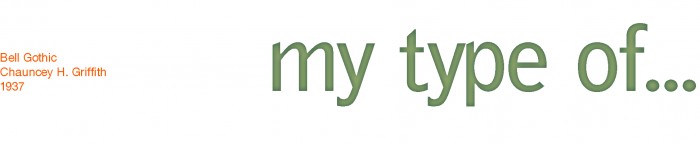
It’s the start of December, which means a new header for  “my type of…” blog.  Notice the header? You know how I change the typeface every month (go look in the header archive if you haven’t), well now you have a chance to get your typeface up there. This is an open call to showcase new typefaces!

For this month I present to you ‘Punch’ by UK  graphic designer Christopher Skinner. (Me!)

This typeface was first developed for a book design project earlier this year and only consisted of the characters required. Although this design was rejected in favour of a different typographic approach, I was sufficiently pleased with it to develop it into something a little more useable.

The original characters are actually created using a hand punch on some stiff card, which was then photographed with lighting arranged to highlight the depth. Much PhotoShoppery was applied to enable this to work on a variety of surface images…

It is obviously not a functioning font, but is good for a few words here and there.

LINKS
Lestaret
Lestaret’s Blog

So what typefaces have you designed? I would like to feature new work, experiments and non-commercial typefaces once a month – all you have to do is send me an email with a small sample image attached and a little information about your design. Submissions are welcome from professional designers, students and the typographically inclined.

christopher (at) lestaret (dot) com

I will get back touch with you for more samples and information as I update the blog. Of course, any work submitted will be attributed to you, and links to your website/blog/shop will be included. It’s over to you…