Archives for posts with tag: city typography

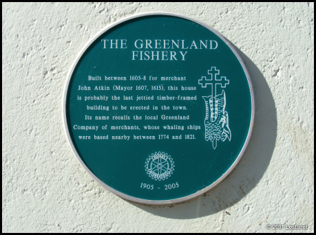
GREENLAND FISHERIES, BRIDGE STREET

Each year the historic buildings in King’s Lynn throw open their doors to the public. Organised by the town’s very active Civic Society, it is an opportunity to visit some of Lynn’s excellent old buildings, many of which are private dwellings or only partially open to the public. I have visited many of the main ones (who will eventually find their way here!) but there are also lots of little hidden gems like the Greenland Fisheries.

The sign outside refers to its time as a pub frequented by fishermen (Lynn was once a whaling port) but it dates back to 1605 when it was built as a merchants house:

I was drawn here by the promise of some hand painted lettering and wall decoration and was not disappointed:

The King’s Lynn Preservation Trust have been working on the restoration and made an excellent job of revealing this long lost work from beneath the plaster. Check the links at the end of this post for more information on the restoration and the building.

Above the window on the second floor is this phrase on several wooden panels at about 5 feet long. This is a composite image and will enlarge well when clicked:

In the tiny back yard this dedication stone stood forlornly against the wall…

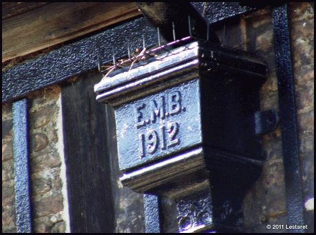
And even the drainpipes got the typographic treatment in cast iron!

LINKS
Kings Lynn Preservation Trust
Kings Lynn Civic Society
Whaling from Kings Lynn

So what’s in your neighbourhood?

I am putting out a request for contributors for the “my type of… place” section of this blog and would like you to put together your own typographic tour. If you are interested, download the contributors information sheet for more details, ideas and specifications here.

A WANDER AROUND ST.PAUL’S, SOUTH ALONG THE RIVER & QUEENS PARK

The second installment of an epic meander through the capital in September…

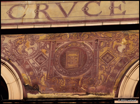
Starting in Carter Lane, just south of St.Paul’s at what is now a rather down-at-heel YMCA in a spectacularly decorated and sadly dilapidated state. This building, once the choir boys school, is liberally covered in lettering and decoration in a technique called ‘sgrafitto’ where layers of coloured plaster are spread over each other, and the top layer is scraped away to reveal the colour beneath. Water damage has made some probably irreversible damage to this delicate plasterwork. Grrr.

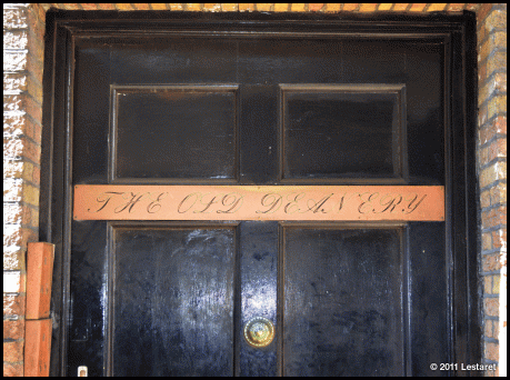
The building is also adorned with other decorative features too like this corner plaque at the rear, where the building joins the old Deanery which needs to be tried for crimes against setting copperplate script in all caps!

On the way through Cheapside we found this marble slab with some pretty uninspiring typography:

Wordsworth would probably spin in his grave if he saw just how a poor choice of typeface could reduce a poem to just words in stone…

Across the river, on Shad Thames some pretty nasty kerning was found… 

But was all redeemed after a couple of pints in The Rake near Blows yard…

Followed by more pints in a variety of establishments along the river…

And some excellent noodles at Cha Cha Moon, with its elegant typography and nimble neon sign…

There were other places after that, but much of that is now strangely lost to me.

The following morning after a hearty fried breakfast we wandered the streets of NW6 and found some items of interest…

And at the point at which I could take no more Helvetica, I spotted this elegant handwritten note alongside some more. I sincerely hope that you are only getting your own mail now, Janette.

So what’s in your neighbourhood?

I am putting out a request for contributors for the “my type of… place” section of this blog and would like you to put together your own typographic tour. If you are interested, download the contributors information sheet for more details, ideas and specifications here.

BY GLENN ADAMS

As a small town boy from the east of England with roots in east London, visiting cities have always been the norm for me, so a trip to Paris to celebrate my first anniversary with my girlfriend Kim seemed like an opportunity to take plenty of “touristy” photos and soak up the romantic atmosphere.


From the second we arrived it was love for both of us taking morning walks down the banks of the Seine (granted it was October so it was a tad chilly) and browsing the small boutique shops of the latin quarter.

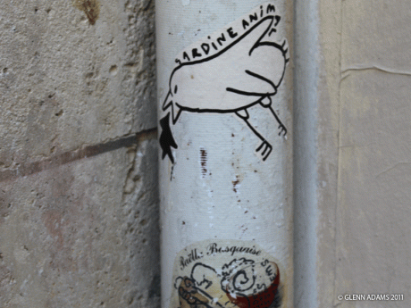
What really grabbed me for the whole of my stay was the underground graffiti art of Paris. Using conventional spray and stencil work with prints and graphics the results are unique and always eye catching.

 All cities have their own underground art scene each with its own feel and style but the Parisian style is truly something else.

I had fallen in love with this Paris that mixes English and French to express the new, making you feel like one of the cool kids being invited.

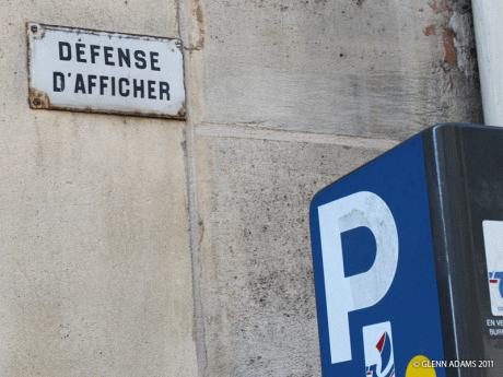
The biggest embodiment I found of this was in Rue Saint-Honoré in a store called Colette, literally selling everything you need to impress and burn a few hundred euros. It wasn’t the shop that impressed me though, but what was on the side of the building, a white garage door with simple blue spray paint that somehow made me stop in my tracks.


LINKS
http://www.glennadamsphotography.co.uk/

Many thanks for your observations Glenn – it’s great to see how other people pick up on the style of cities and think that this offers another viewpoint of this over photographed city! And best wishes to you and Kim!

So what’s in your neighbourhood?

I am putting out a request for contributors for the “my type of… place” section of this blog and would like you to put together your own typographic tour. If you are interested, download the contributors information sheet for more details, ideas and specifications here.

 by Lisette van de Graaf


Barcelona is a city of designers and therefore graphic design can be seen everywhere, in many shapes and forms. So when Christopher invited me to write a guest post for his blog, it was hard to decide on what to choose. Finally, I decided to go with the graphic design and typography that we tend to overlook, as they are omnipresent and such a part of our daily lives that we no longer ‘see’ it. No doubt a lot of work went into creating these examples, so they are well worth showcasing.
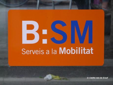
The above logo belongs to Barcelona de Serveis Municipals, and more specifically to their network of parking spaces, which can be found all over the city and used by cars, motorbikes and bicycles alike. This particular one belongs to a car park on Carrer Bergara. Below, another example of graphic design for the local council. In this case, it’s for Department for Environment, a council department in charge of managing quality and sustainability criteria for the
provision of urban services and the maintenance of the environment. One of their domains is waste management, to which this logo belongs.


Found underfoot, on Ronda Universitat, is this lovely cast iron cover with the name of its maker prominently displayed. This is not very common these days, as this type of lid usually shows the name of the service provider whose tunnel it covers.


Another ‘old school’ example, is this sign found in the Muntaner underground train station. No doubt the designers of this enamel sign were much inspired by the signs used in the London Underground, for there are a number of similarities to be found.


Much more modern is the design for the local council bikes, called Bicing. Hugely popular, they are used by approximately 58,000 people every day. Their docking stations can be found all over town, and are a great way to move around the city. As use of these is per annual subscription, they are not available to tourists.


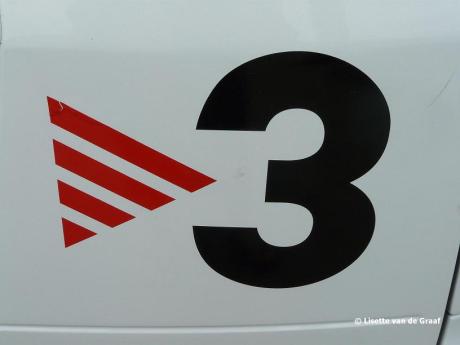
Found on a car at a petrol station: the logo for Catalonian television station TV3 – watching their programs is a good way to brush up one’s Catalan language skills!


An old logo which no doubt will be removed soon. It belongs to the former version of the waste disposal department of Barcelona’s city Council. For the design of this logo use was made of the simple floral pattern that can be found in many of Barcelona’s street tiles.


Two similar fonts have been used by Fira de Barcelona and the Regional Train Company, Ferrocarrils de la Generalitat de Catalunya, or FGC. Barcelona considers itself to be a modern city, and so all things graphic are continually renewed and redesigned. As a consequence, most fonts used are clean and simple, especially when used by the various local council bodies.
Thanks Christopher for the invitation to share my type of Barcelona with your readers. I hope you
have all enjoyed this selection.


LINKS
http://www.bsmsa.cat/mobilitat/index.php/home
http://w110.bcn.cat/portal/site/MediAmbient?lang=en_GB
http://www.bicing.cat/
http://cutesuite.wordpress.com/

Thanks to you too Lisette – your blog is a great source of images of modern urban Barcelona – I hope you’ll consider submitting more images soon!

So what’s in your neighbourhood?

I am putting out a request for contributors for the “my type of… place” section of this blog and would like you to put together your own typographic tour. If you are interested, download the contributors information sheet for more details, ideas and specifications here.

A WANDER AROUND FARRINGDON, CLERKENWELL & THE BARBICAN

Its great heading into London for mooch around with like-minded friends. This is part 1 of a long meander, but where better to start than this defunct art supplies shop, still displaying fading adverts for Letraset, Mecanorma and other relics of a bygone age… aah!

I love the juxtaposition of the designer Helvetica sign alongside the original ‘Girls & Infants’ stonework – I’m sure this has been positioned here deliberately!

Around the corner is the old Clerkenwell  Workshops building, now very much a mixed used space, but still proudly displaying its origins

And the subtly cropped Helvetica of one of the areas top design studios…

The best three kings… ever!

The elegance of this whitewashed arch, complete with decorative quoin and understated lettercarving is in stark contrast to the suggestion of the wittily altered street sign!

Above, a very large and bizarre looking number – reminds me of poor quality graffiti!

Whilst below is a more traditional sign with a curiously upside down final letter!

St. John Street has a number of fine architectural details, many of which all relate to the original of the St.John’s Ambulance organisation.

As you wander around, there are legacies of previous uses that have been retained more subtly, and others that are probably some of the deepest carvings around.

And so we get to the ‘love it or loath it’ monolith of the Barbican. I have always had a sneaky admiration for brutalist urban town planning – although much of them never lasted beyond 20 years before they were considered worse than the car parks of the same era!

Somehow, this place has worked. Yes, it’s not pretty, and yes, lots of Londoners and foreigners hate it too, but there’s no denying it works. These places are highly sought after, and for the typographer they retain much of their original Helvetica signage:

Although much of what has been retained has been abused – is that a Gill Sans ‘a’? Wall Side or Wallside? And is that ‘s’ upside down too?

At this point it was raining hard, and coffee had become a necessity, so I’ll leave you with a reflection as well made our way towards St.Pauls…

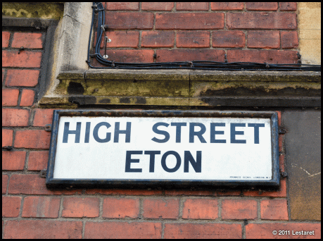
It is a place mostly associated with elite education, privilege and money. It also is pretty good for the urban typography spotter too.  Up the High Street is the town chemist (by Royal Appointment to the House of Windsor too) with its peeling paint and 1970’s illuminated sign above:

There are a couple of old style post boxes in very good condition, one with its removable direction sign – I believe that this is a ‘Type B Edward VIII Model from 1936. Further along is this 1856 Fluted Pillarbox with its vertical slot and rain guard! Apparently quite rare these days!

Although not everything old has been lovingly preserved like this beautifully decaying stand off sign high above street level:

And this metal wall sign on the local garage:

Obviously, there are some lovely old buildings with fine architectural detailing, including these curiously affixed numbers above and the discreet but elegant hand painted labelling of the College buildings which can be found at almost every turn:

And where they are not black on white, they are white on black:

In front of the imposing College Chapel stands a WW2 memorial featuring a a fragment of verse by Old Etonian Thomas Grey, with uncomfortably spaced swash capitals…

Back in the town, the Ex-Servicemen’s club makes a bold statement,

whilst above it, set into a blank window feature is this white stone dedication:

Whilst I couldn’t suppress a childish snigger at the school in his name…

And never walk past a hostelry with your name on it:

LINKS
Eton College
Historic Post Boxes

Eton has some very fine examples of urban typography and is a great place to wander about with a camera.

So what’s in your neighbourhood?

I am putting out a request for contributors for the “my type of… place” section of this blog and would like you to put together your own typographic tour. If you are interested, download the contributors information sheet for more details, ideas and specifications here.

Bracknell town centre is largely given over to a pedestrianised civic area built in the 1960’s and is showing it’s age. I bet it was really smart in it’s heyday, but now, like most medium towns, it is in need of some re-investment. I thought I’d capture someting of the signage whilst I was there:

But it is inbetween the shops where something begins to emerge – entrances to the offices and spaces above the ground floor shops – these dot each stretch of shops and lay mostly unnoticed by the local populace…

LINKS
Backnell Wikipedia
Bracknell Town Centre

I quite liked Bracknell – I have a strange admiration for those concrete town planning schemes of the era, even though the reality never quite lived up to the ideal…

So what’s in your neighbourhood?

I am putting out a request for contributors for the “my type of… place” section of this blog and would like you to put together your own typographic tour. If you are interested, download the contributors information sheet for more details, ideas and specifications here.

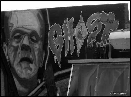
It’s the holiday season in good old blighty and what better way to celebrate by taking a look at off-season Hunstanton in north Norfolk.

I love this place. It is my nearest resort (about 15 miles away) and spend lots of time at the beach and in the town, and consume a rather fulsome amount of fish’n’chips! Sunny Hunny as it is affectionately known is a thriving seaside town, unlike many others which become ghost towns during the winter months, but its fairground holiday entertainments must inevitably close up for the off-season.

I must confess to a liking of seaside towns in the off-season. There is something sad and desolate about these places that for most people hold strong memories of long-gone summer holidays. It is a little like a forest in winter, bare, fragile and exposed, waiting for the first signs of spring so that it can burst into life once more. 

Thes images were taken late morning on 2nd January this year during a long walk to blow away some of the festive lethargy that had settled.

I will be back in Hunny soon with more summery images!


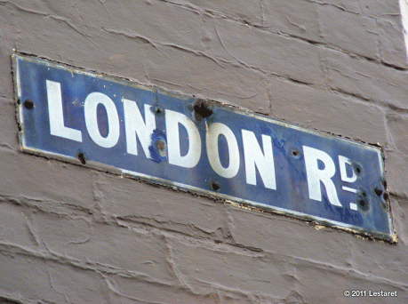
London Road snakes southwards out of Sheffield town centre for about two miles. The majority of these images were taken in the first ¼ mile and the environs nearby, known locally as ‘the bottom of London Road.’ I always liked it around here. I had some mates who lived nearby, and there used to be some great pubs  – this used to be one of the best pub crawls in Sheffield on a Friday and Saturday night, but many have long since been converted into other things or stand silently watching the passing traffic, their weathered boards coated in many seasons of flaking flyposters.
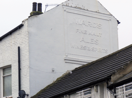

Taken from an adjoining road from the rear of The Old Crown, high up above the neighbouring buildings is this plasterwork sign for the once mighty Sheffield brewer Ward’s. I imagine this would have also been brightly painted at one time.


The frontage seems to have been become infected with “creeping signitis”


The plaster sign on the other gable end was still visible but had been usurped by a newer neighbour, whose falling tiles and attractive window decoration looked rather ironic beside the Old Crown…


At the Highfield area I spotted these two post office signs competing with each other, doing an excellent job of hiding the old street sign which had helpfully been painted the same colour as the wall!
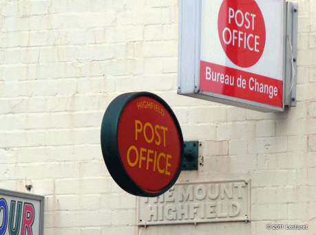
Across the road, these two signs are really showing their age.
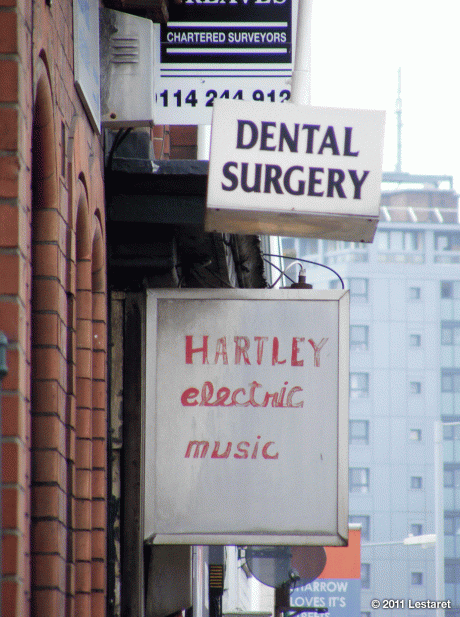

The dentists also still retained the original gilt signwritten names above the door.


Nearby, this little old fellow caught my eye amongst the general garish signage.


I thought I would show the surrounding buildings for context so took a wider shot. It is at the right of the image below, just above the white van…


But if you look at the wall above the Chinese restaurant sign you will see this:


Older signage, painted over still older signage, still holding its own amongst the plastic and neon of the twenty-first century!


There is a lot of this about – retaining the old street signs, but painting over them. Odd, but nice that they are there to be spotted by the more observant. This one is on the corner of a side street, above this ‘Gentlemans Outfitters’ which I was very pleased to see was still in business and had not updated its 1960’s signage.


At the very bottom of London Road, there is a small car park whose adjoining buildings have been subjected to some neat graffiti…


Opposite, once stood an iconic Sheffield landmark building – ‘The Locarno.’ Well, actually, if the truth be told, it is still there. Kind of. Situated on what has become prime real estate, this old nightclub could not be actually demolished because of its listed facade. So what did they do? Built an ugly, characterless block of student flats behind it and shoe-horned a supermarket behind its beautiful grey and white tiled facade. The mind boggles.


As I was crossing over to see if there were any signs or plaques that celebrated its past life (none) I noticed some much newer lettering up on the side of the building…


Which turned out to be some poetry by that old local fraud  pop star Jarvis Cocker for a poetry festival.


I just hope that the Pulp frontman is implicated at the trial for these crimes against typography… Still I bet they won’t be around for a century, unlike these regal fellows further up the road…
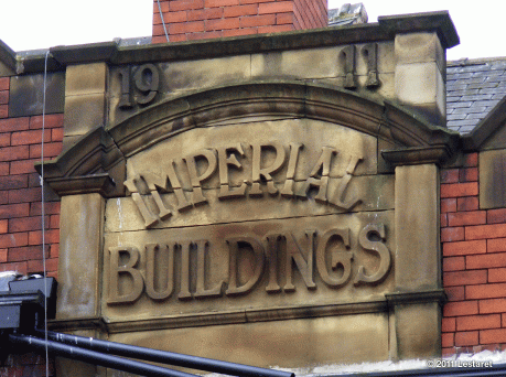

I began to wander down some side streets. There are a lot of old workshops and businesses amongst the housing estates that I thought might give me a few treats, and I wasn’t to be disappointed…


I am particularly pleased with this shot above, which encompasses cast iron, plaster and vinyl signage. And these two no parking signs just made me smile…


This building looks like it has seen better days, but had a lot of businesses still operating beneath its decaying sign, like this one, who still make type punches and the like. Excellent!

I ventured down John Street towards Bramall Lane (home of Sheffield United FC) to get a shot of The Cricketers Arms pub which I’d passed the day before.

I don’t hold out much hope for a full restoration of this building and wanted to record its lettering before it disappeared. Whilst I was here though, I was struck by the very odd juxtaposition of this pub – right across the road from the football stadium!

As I was heading back I ventured up Queens road, a very busy thoroughfare – five lanes in places – and at this point filled on both sides with superstores and DIY depots. At the lights I noticed this new furniture showroom and quickly pulled into the car park across the road to check if I what I had seen was true.

Surely, if the store had just opened, they could have put up a new banner. This looks like it was last used during the South Yorkshire hurricane season, but oddly, the rest of the store is all squeaky clean…

I was heading this way on a slight detour a little further around the corner on Broadfield Road; Heeley Baths! I lived in Heeley for the first 13 years of my life and this place holds many memories for me. 
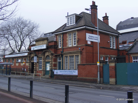
We we all taught to swim here, and as children, great parties of us would walk here every saturday afternoon, with our trunks wrapped in our towels,  for some chlorine-soaked fun!

Sadly, the new signage does not really compare to the original…

Further on I pulled over and walked back to get a shot of this ghost sign, still gamely hanging on to its message…


I spent a very pleasant early summer sunday morning at Castle Rising with Mrs.Lestaret and my two daughters, Upper and Lower Case. The castle proudly claims to be the finest 12th century Norman Keep in the country, and rightly so. What’s more amazing is that it is still privately owned by the Howard Family since 1544!


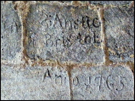
After the usual excited roaming and exploring, I got stuck in to recording the various carved graffiti, with much tut-tutting and rolling of eyes from my long-suffering family.


I assume (because of it’s position near the floor and its consistency) this is a more official inscription following some restorations…


W.T. made a decent stab at a crossed W, but didn’t quite make the horizontal alignment work. Then again, this was on a downward facing diagonal over the fireplace!


The seventies made their mark but without the elegance…

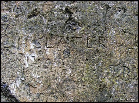
Just inside the main hall is this stretch of dressed wall which has been a place of opportunity for many over the years, but sadly this overuse has created an erosion far quicker and destructive than time and the elements ever would…


I have taken quite a lot of these types of images over the years – castles, churches and monuments have always been a target for the determined ‘tagger.’ I guess I am a sucker for elegant graffiti and will sort more out for future post!

LINKS
Castle Rising

So what’s in your neighbourhood?

I am putting out a request for contributors for the “my type of… place” section of this blog and would like you to put together your own typographic tour. If you are interested, download the contributors information sheet for more details, ideas and specifications here.